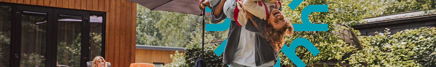
Bent u op zoek naar een vakantiehuis, waar u heerlijk kunt relaxen maar ook actief kunt zijn? Dan bent u hier op de goede plek. U vindt hier een ruim aanbod aan huisjes in Nederland, België én Duitsland. Kies uit particuliere vakantiehuizen, groepsaccommodaties of huisjes op een vakantiepark. Kom tot rust, en beleef een heerlijke vakantie!
 9,0
9,0
9,0
9,0
 9,4
9,4
9,4
9,4
 9,8
9,8
9,8
9,8
 9,1
9,1
9,1
9,1
 9,0
9,0
9,0
9,0
 8,9
8,9
8,9
8,9
 9,8
9,8
9,8
9,8
 9,8
9,8
9,8
9,8
 9,8
9,8
9,8
9,8
 9,6
9,6
9,6
9,6
Bent u op zoek naar een vakantiehuis, waar u heerlijk kunt relaxen maar ook actief kunt zijn? Dan bent u hier op de goede plek. U vindt hier een ruim aanbod aan huisjes in Nederland, België én Duitsland. Kies uit particuliere vakantiehuizen, groepsaccommodaties of huisjes op een vakantiepark. Kom tot rust, en beleef een heerlijke vakantie!
Een huisje huren aan de kust, het water of toch liever in de natuur? Op Heerlijke Huisjes vindt u het huisje dat bij u past. Ons ruime aanbod van heerlijke huisjes is groot. Dat is ook niet zo gek, want iedere provincie in Nederland, België en Duitsland heeft een eigen karakter, cultuur en omgeving. Kies voor een mooie groepsaccommodatie (vakantiehuis voor meer dan 10 personen), een particulier vakantiehuis op een unieke locatie met veel privacy of juist een huisje op een vakantiepark, waar u optimaal gebruik kunt maken van allerlei faciliteiten. Heeft u een gezin met jonge kinderen? Of wilt u graag genieten van veel faciliteiten dichtbij? Wanneer u een gezin heeft met jonge kinderen of voorzien wilt zijn van alle faciliteiten in de buurt, dan is een vakantie op een vakantiepark de beste keus! Onze vakantieparken liggen niet ver weg van de Randstad, waardoor u nooit lang onderweg bent, maar u toch in een andere omgeving waant. Op een vakantiepark vindt u vaak diverse voorzieningen, zoals een zwembad, fietsverhuur, restaurant of speeltuinen. Op een vakantiepark kunt u soms ook gebruikmaken van een sauna. Sommige vakantieparken bieden een activiteiten- en animatieteam. Ideaal vermaak voor de kinderen, zodat u tot rust kunt komen. Ontdek onze heerlijke parken bij het strand, het bos en het water.
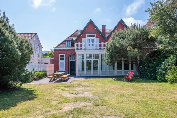
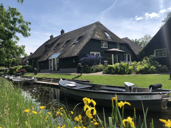
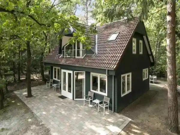
Waar komt u beter tot rust dan in een comfortabel vakantiehuisje, bij een particuliere eigenaar? Geniet in alle rust en privacy die u maar kunt wensen. De particuliere vakantiehuizen zijn in de meest prachtige en natuurrijke omgevingen te vinden. Zo kunt u een kijkje nemen in het lokale leven van de bewoners. Een authentieke boerderij, een knus appartement of een gezellige bungalow: het behoort allemaal tot de mogelijkheden. Het huren van een vakantiehuis van een particuliere eigenaar vormt de ideale uitvalsbasis voor een heerlijk ontspannen vakantie. Ga er lekker op uit met de fiets, te voet of met een bootje en geniet van al het moois dat de regio u te bieden heeft. Of verken de omgeving te paard! Sommige eigenaren wonen dichtbij en maken u graag wegwijs in de mooie omgeving van uw vakantiehuis. Ideaal, want zo bent u goed geïnformeerd over de bezienswaardigheden en evenementen in de buurt. Kortom, een leuk en uniek vakantiehuisje huren doet u bij een gepassioneerde eigenaar!
Bent u op zoek naar een groot vakantiehuis voor tien personen om met de hele familie of vriendengroep vakantie te vieren? Bekijk dan onze groepsaccommodaties. Een groepsaccommodatie staat garant voor een heerlijke vakantie met een groot reisgezelschap. Groepsaccommodaties zijn van alle gemakken voorzien en beschikken soms zelfs over een indoorspeelruimte of bar. Ook zijn de accommodaties uniek. Zo kunt u denken aan verbouwde boerderijen, oude monumentale panden en kerkjes.
Tijdens de vakantieperiode is een vakantiehuis huren ongekend populair. Dat is niet gek, want er is nog zoveel te ontdekken dichtbij huis! Pak de auto, trein of zelfs de fiets en navigeer binnen drie uur naar uw heerlijke vakantieadres. De meeste mensen huren een vakantiehuis voor de zomervakantie, want met die warme zomers van afgelopen jaren zijn is het in de maanden juni, juli en augustus heerlijk vertoeven in Nederland. Of combineer een zomervakantie in het buitenland met een korte vakantie dicht bij huis, in de voorjaars-, mei- of herfstvakantie.
Ook tijdens de vele feestdagen die ons land rijk is, is het overwegen van een vakantie zeker de moeite waard. Terwijl de eerste lammetjes geboren worden, boekt u tijdens Pasen een gezellig vakantiehuis om het voorjaar in te luiden. Maar ook tijdens Hemelvaart en Pinksteren zijn er genoeg mogelijkheden. Geniet met het gezin en ga eropuit! Een ideale periode, omdat er vaak tal van leuke en extra activiteiten worden georganiseerd door musea, pretparken, dierentuinen en speeltuinen. Wilt u eens echt lekker uitpakken? Boek dan een vakantiehuisje of groepsaccommodatie tijdens Kerst of oud en nieuw en geniet op een bijzondere locatie van deze gezellige familiedagen.
Even ontsnappen uit de dagelijkse hectiek? Boek dan een weekendje weg en geniet! Een weekendje weg komt nooit ongelegen en kan het hele jaar door een uitkomst bieden om even tot rust te komen. Zo boekt u tijdens de wintermaanden een vakantiehuis met sauna om heerlijk te ontspannen, in de lente een vakantiehuis bij het bos om te genieten van de ontluikende natuur of in de zomer een vakantiehuis aan de kust om lekker pootje te baden in de zee. Onze vakantiebestemmingen in Nederland, Duitsland en België zijn altijd dichtbij, zodat het genieten snel kan beginnen. Gaat u spontaan op vakantie? Bekijk dan zeker ons last-minute aanbod in Nederland, Duitsland en België en profiteer van de aanbiedingen.
Wat een vakantiehuisje heerlijk maakt is voor iedereen anders. De één omschrijft heerlijk als een luxe villa met hottub, terwijl het voor een ander een bungalow midden in het bos betekent. Hoe u heerlijk ook omschrijft, u vindt altijd uw eigen heerlijke huisje in ons ruime aanbod vakantiehuizen in Nederland, België en Duitsland. Een huisje huren doet u bij Heerlijke Huisjes.
Ons aanbod vakantiehuizen is gelegen in Nederland, België of Duitsland. Het aanbod varieert van authentieke particuliere vakantiehuizen tot een vakantiehuisje op gerenommeerde vakantieparken. Van Groningen tot de Ardennen, België en van Noord-Holland tot Hessen, Duitsland. Allemaal dichtbij en binnen drie uur rijden vanaf uw huis.
De heerlijkste vakantiehuizen aan zee vindt u in Zeeland, Zuid-Holland en Noord-Holland. Veel van de vakantiehuizen zijn op loop- of fietsafstand van de kust gelegen zodat u in no time op het strand bent en lekker kunt genieten van de kust.
Een vakantie is niet compleet zonder uw huisdier. Daarom zijn er veel vakantiehuizen waarin uw huisdier van harte welkom is. In sommige vakantiehuizen zijn zelfs meerdere huisdieren welkom. Dus ook als u meer dan één huisdier heeft is er altijd een heerlijk vakantiehuis voor u. Dus gaat u voor lange strandwandelingen of een actieve wandeling in het bos?
Alle vakantiehuizen op Heerlijke Huisjes zijn altijd uitgerust met een eigen keuken en sanitair. Zo bent u niet afhankelijk van voorzieningen buiten de deur. Daarnaast is elke vakantiehuis een heerlijk huisje. Voor de een is dit een luxe villa met hottub en voor de andere een eenvoudige bungalow midden in de natuur. Waar u ook naar op zoek bent, in ons ruime aanbod vindt u altijd uw heerlijke huisje. Tot slot dient het huisje binnen ongeveer drie uur te bereiken zijn vanaf de Randstad.

 Kaartweergave